How to use Ant. Design? Theme, Style, Customize components in an easy way? solutions?
Greeting Reader! 🙏
Ant design is one of the most popular UI library, widely used with ReactJs. It has awesome components, Design guidelines, extra support to create the best template but beginners find it very difficult to override.
When I started using antd 2 years back it was complicated as well I was new to the React ecosystem.
Few basics issues we might find while using the antd: -
- Most of the explanations or doc you find in Chinese Lang including Github issues.
- Once you install the antd project "Real Project with UMI" you may be lost what to do next?
- If we "Install presets" as per the document then we bound to use the system as its design.
- How to override the component styles, like button, drawer, modal, forms, input boxes, date picker, etc.
- install presets(including the antd, dva, locale plugins): ITs all about the Redux, Redux-Saga, a plugin like webpack, moment, etc.
- When to use Ant. Design Pro Template or normal with basic styles.
- How to manage theme?
- How to manage the Redux store? where to write reducer, action, & how to update the state of an application?
- How to Integrate with Rest API & remove the dummy moc API from the application?
- Build & Test, Deploy?
Answers to the Above points: -
1. I've seen the improvement in doc day by day, but if you find the Chinese language and unable to understand it, Then just translate the page, and to make its persistent fix we can do this by "Edit this page on GitHub!" option, we all knew its opensource project then we can also contribute at least the translation of the page or component which we are unable to understand currently.
2. Once you start with "Real Project with UMI", UMI itself a bundle of many things like webpack, handling the root of the application with redux, and it supports the plug-play system. I know it is not the answer you're looking for, sometimes I also lost, but keep in mind the above 1 point help me always, and you can also find the Github issues & visit the official doc of UMI.
3. Once the preset is install you're bound to use the current options, in preset will get all sorts of everything like, Model, Services, Redux store, everything is already included & you need not use Zero configurations. But if you're trying to customize more n more like webpack bundlers, build process, Own Redux, Routing configurations, etc, then I will recommend you not to use the "preset" try setting-up every module from scratch.
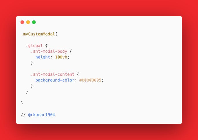
4. To override the component its seems difficult but it's very easy if you follow the correct guideline. let's see what is the possible way to customize it.
use the property className and write CSS in less file.

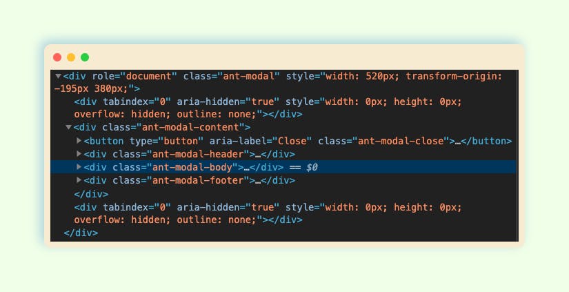
According to the component, antd class will be different & to identify them using chrome inspector tools will help you, find the correct class, and override CSS for it. check the screenshot!

5. Once you decided to go with "preset" or UMI
Configuring with es6 syntax is supported in .umirc.ts or config/config.ts. A common configuration looks as below:
export default {
  base: '/docs/',
  publicPath: '/static/',
  hash: true,
  history: {
    type: 'hash',
  },
}
.umirc.ts is the configuration file - in you can define the route, locale, title, public path, baseUrl, etc.
6. When to use Antd Pro or antd just components? the answer depends on the requirement, if you're going to build a new enterprise application then go for Ant Pro, & it's just a template with prebuilt basic pages.
if you're looking for an admin panel then use the ant pro otherwise custom design and the custom component will work fine.
Sometimes you may require a mix of both the things, I use antd pro only - Layout, Router & Nav, Dynamic -Theme, few other configurations.
7. How to manage theme?
a) In antd you can use Ant Design Less variables to modify the theme.
There are some major variables below, all less variables could be found in Default Variables .
@primary-color: #1890ff; // primary color for all components
@link-color: #1890ff; // link color
@success-color: #52c41a; // success state color
@warning-color: #faad14; // warning state color
@error-color: #f5222d; // error state color
@font-size-base: 14px; // major text font size
@heading-color: rgba(0, 0, 0, 0.85); // heading text color
@text-color: rgba(0, 0, 0, 0.65); // major text color
@text-color-secondary: rgba(0, 0, 0, 0.45); // secondary text color
@disabled-color: rgba(0, 0, 0, 0.25); // disable state color
@border-radius-base: 2px; // major border radius
@border-color-base: #d9d9d9; // major border color
@box-shadow-base: 0 3px 6px -4px rgba(0, 0, 0, 0.12), 0 6px 16px 0 rgba(0, 0, 0, 0.08),
  0 9px 28px 8px rgba(0, 0, 0, 0.05); // major shadow for layers
b) Customize in Umi
You can easily use theme field in config/config.js (Umi) or umirc.js file of your project root directory if you are using Umi, which could be an object or a javascript file path.
"theme": {
  "primary-color": "#1DA57A",
},
or just create the theme folder and mytheme.js
"theme": "./theme.js",
if all the above solutions are not working!
You must import styles as less format. A common mistake would be importing multiple copied of styles that some of them are css format to override the less styles.
- If you import styles by specifying the style option of
babel-plugin-import, change it from 'css' to true, which will import the less version of antd. - If you import styles from
'antd/dist/antd.css', change it toantd/dist/antd.less.
useful link: antdtheme.com
8. How to manage the Redux store? where to write reducer, action, & how to update the state of an application?
The First thing to manage all the main part application with folders like,
- models 📁
- pages 📁
- components 📁
- layouts 📁
Example: -
9. How to Integrate with Rest API & remove the dummy moc API from the application?
The above example close enough to explain how to use the rest API, the approach could be different in every project. Here is the recommendation -
- Use env to manage the development, staging, and production URL, link for ant pro to manage env
- use separate modal, services, and pages with components every possible way.
- if you need to remove the dummy or moc data from the application
$ npm run start:no-mock& restart the application.
10. When you finish the development, you can run the following command to build your application:
Steps
i) yarn build or npm run build 🚀
Since Ant pro use Umi as a development tool, complex processes have been encapsulated and for most scenarios only one command umi build is required to build the package, after build successfully, it will generate the dist folder in the root directory, which contains packaged files, usually static files like .js, .css, index.html
Recommended after build test
ii) yarn analyze or yarn run analyze 📊
If your build file is large, you can optimize your code with the analyze command to build and analyze the volume distribution of dependent modules.
iii) Test the build 🧪
To test the build we need to run the application locally to check if everything is working as expected!
We need to create a file server.js in root dir and it will be ExpressJs setup to test the build.
iv) now run the following cmd
node server.js & check the localhost:9000
Congratulation you made it. 🏆
I hope you enjoyed, learned, and remember...🙌
If you liked it please leave some hearts to show your support. Also, leave your responses below and reach out to me if you face any issues.
You can find me on Twitter rkumar1904 & Hashnode Rajesh Kumar
